Getting started
gcplyr is a package that implements a number of
functions to make it easier to import, manipulate, and analyze microbial
growth from data collected in multiwell plate readers (“growth curves”).
Without gcplyr, importing and analyzing plate reader data
can be a complicated process that has to be tailored for each
experiment, requiring many lines of code. With gcplyr many
of those steps are now just a single line of code.
This document gives an introduction of how to use gcplyr
for each step of a growth curve analysis.
To get started, you need your growth curve data file saved to your computer (.csv, .xls, or .xlsx).
Users often want to combine their data with some information on the
experimental design of their plate(s). You can save this information
into a tabular file as well, or you can just keep it handy to enter
directly in R (see
vignette("incorporate_designs")).
Let’s get started by loading gcplyr. We’re also going to
load a couple other packages we’ll need.
library(gcplyr)
#> ##
#> ## gcplyr (Version 1.6.0, Build Date: 2023-09-13)
#> ## See http://github.com/mikeblazanin/gcplyr for additional documentation
#> ## Please cite software as:
#> ##   Blazanin, Michael. 2023. gcplyr: an R package for microbial growth
#> ##   curve data analysis. bioRxiv doi: 10.1101/2023.04.30.538883
#> ##

library(dplyr)
#>
#> Attaching package: 'dplyr'
#> The following objects are masked from 'package:stats':
#>
#>     filter, lag
#> The following objects are masked from 'package:base':
#>
#>     intersect, setdiff, setequal, union
library(ggplot2)
A quick demo of gcplyr
Before digging into the details, here’s a simple demonstration of
what a final gcplyr script can look like. This script:
- imports data from files created by a plate reader
- combines it with design files created by the user
- calculates the maximum growth rate and area-under-the-curve
Don’t worry about understanding all the details of how the code works right now. Each of these steps is explained in depth in later articles.
# Read in our data
#  (our plate reader data is saved in "widedata.csv")
data_wide <- read_wides(files = "widedata.csv")

# Transform our data to be tidy-shaped
data_tidy <-
  trans_wide_to_tidy(wides = data_wide, id_cols = c("file", "Time"))

# Convert our time into hours
data_tidy$Time <- as.numeric(data_tidy$Time)/3600

# Import our designs
#  (saved in the files Bacteria_strain.csv and Phage.csv)
designs <- import_blockdesigns(files = c("Bacteria_strain.csv", "Phage.csv"))

# Merge our designs and data
data_merged <- merge_dfs(data_tidy, designs)
#> Joining with `by = join_by(Well)`

# Plot the data
ggplot(data = data_merged,
       aes(x = Time, y = Measurements, color = Well)) +
  geom_line(aes(lty = Phage)) +
  guides(color = "none")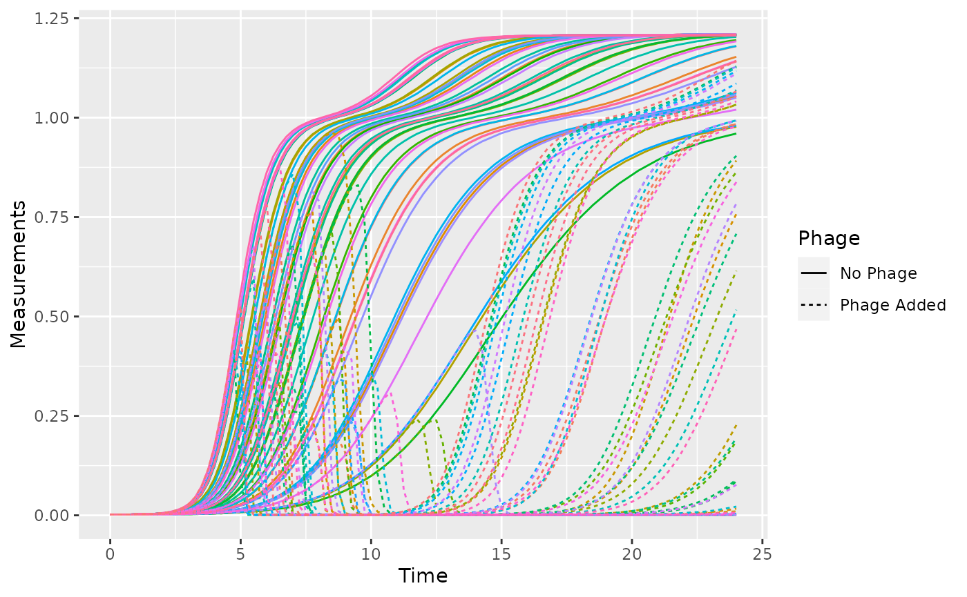
# Voila! 8 lines of code and all your data is imported & plotted!

# Calculate the per-capita growth rate over time in each well
data_merged <- mutate(
  group_by(data_merged, Well),
  percap_deriv = calc_deriv(y = Measurements, x = Time, percapita = TRUE,
                            blank = 0, window_width_n = 5))

# Calculate two common metrics of bacterial growth:
#  the maximum growth rate, saving it to a column named max_percap
#  the area-under-the-curve, saving it to a column named 'auc'
data_sum <- summarize(
  group_by(data_merged, Well, Bacteria_strain, Phage),
  max_percap = max(percap_deriv, na.rm = TRUE),
  auc = auc(y = Measurements, x = as.numeric(Time)))
#> `summarise()` has grouped output by 'Well', 'Bacteria_strain'. You can override
#> using the `.groups` argument.

# Print some of the max growth rates and auc's
head(data_sum)
#> # A tibble: 6 × 5
#> # Groups:   Well, Bacteria_strain [6]
#>   Well  Bacteria_strain Phage       max_percap    auc
#>   <chr> <chr>           <chr>            <dbl>  <dbl>
#> 1 A1    Strain 1        No Phage         1.00  15.9
#> 2 A10   Strain 4        Phage Added      1.43   5.57
#> 3 A11   Strain 5        Phage Added      1.47   5.99
#> 4 A12   Strain 6        Phage Added      0.789  0.395
#> 5 A2    Strain 2        No Phage         1.31  19.3
#> 6 A3    Strain 3        No Phage         0.915 15.1

# Plot the results for max growth rate and area under the curve in
#  presence vs absence of phage
ggplot(data = data_sum,
       aes(x = max_percap, y = auc, color = Phage)) +
  geom_point()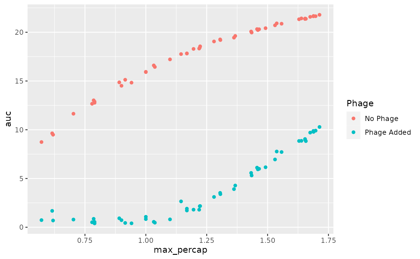
What’s next?
Generally, working with gcplyr will follow a number of
steps, each of which is likely to be only one or a few lines of code in
your final script. We’ve explained each of these steps in a page linked
below. To start, we’ll learn how to import our data into R
and transform it into a convenient format.
- Introduction:
vignette("gcplyr") - Importing and transforming data:
vignette("import_transform") - Incorporating design information:
vignette("incorporate_designs") - Pre-processing and plotting your data:
vignette("preprocess_plot") - Processing your data:
vignette("process") - Analyzing your data:
vignette("analyze") - Dealing with noise:
vignette("noise") - Statistics, merging other data, and other resources:
vignette("conclusion")