Where are we so far?
- Introduction:
vignette("gcplyr") - Importing and transforming data:
vignette("import_transform") - Incorporating design information:
vignette("incorporate_designs") - Pre-processing and plotting your data:
vignette("preprocess_plot") - Processing your data:
vignette("process") - Analyzing your data:
vignette("analyze") -
Dealing with noise:
vignette("noise") - Statistics, merging other data, and other resources:
vignette("conclusion")
So far, we’ve imported and transformed our measures, combined them with our design information, pre-processed, processed, plotted, and analyzed our data. Here, we’re going to learn potential strategies for dealing with noise in our growth curve data.
If you haven’t already, load the necessary packages.
library(gcplyr)
#> ##
#> ## gcplyr (Version 1.6.0, Build Date: 2023-09-13)
#> ## See http://github.com/mikeblazanin/gcplyr for additional documentation
#> ## Please cite software as:
#> ##   Blazanin, Michael. 2023. gcplyr: an R package for microbial growth
#> ##   curve data analysis. bioRxiv doi: 10.1101/2023.04.30.538883
#> ##

library(dplyr)
#>
#> Attaching package: 'dplyr'
#> The following objects are masked from 'package:stats':
#>
#>     filter, lag
#> The following objects are masked from 'package:base':
#>
#>     intersect, setdiff, setequal, union
library(ggplot2)
library(tidyr)
# This code was previously explained
# Here we're re-running it so it's available for us to work with
example_design <- make_design(
  pattern_split = ",", nrows = 8, ncols = 12,
  "Bacteria_strain" = make_designpattern(
    values = paste("Strain", 1:48),
    rows = 1:8, cols = 1:6, pattern = 1:48, byrow = TRUE),
  "Bacteria_strain" = make_designpattern(
    values = paste("Strain", 1:48),
    rows = 1:8, cols = 7:12, pattern = 1:48, byrow = TRUE),
  "Phage" = make_designpattern(
    values = c("No Phage"), rows = 1:8, cols = 1:6, pattern = "1"),
  "Phage" = make_designpattern(
    values = c("Phage Added"), rows = 1:8, cols = 7:12, pattern = "1"))

sample_wells <- c("A1", "F1", "F10", "E11")
Introduction
Oftentimes, growth curve data produced by a plate reader will have
some noise it it. Since gcplyr does model-free analyses,
our approach can sometimes be sensitive to noise, necessitating steps to
reduce the effects of noise.
When assessing the effects of noise in our data, one of the first steps is simply to visualize our data, including both the raw data and any derivatives we’ll be analyzing. This is especially important because per-capita derivatives can be very sensitive to noise, especially when density is low. By visualizing our data, we can assess whether the noise we see is likely to throw off our analyses.
Broadly speaking, there are three strategies we can use to deal with noise:
Let’s start by pulling out some example data. Luckily for us, there is a version of the same example data we’ve been working with but with simulated noise added to it.
# This is the data we've been working with previously
noiseless_data <-
  trans_wide_to_tidy(example_widedata_noiseless, id_cols = "Time")
# This is the same data but with simulated noise added
noisy_data <- trans_wide_to_tidy(example_widedata, id_cols = "Time")
# We'll add some identifiers and then merge them together
noiseless_data <- mutate(noiseless_data, noise = "No")
noisy_data <- mutate(noisy_data, noise = "Yes")
ex_dat_mrg <- merge_dfs(noisy_data, noiseless_data)
#> Joining with `by = join_by(Time, Well, Measurements, noise)`
#> Warning in merge_dfs(noisy_data, noiseless_data):
#> merged_df has more rows than x or y, this may indicate
#>                mis-matched values in the shared column(s) used to merge
#>               (e.g. 'Well')
ex_dat_mrg <- merge_dfs(ex_dat_mrg, example_design)
#> Joining with `by = join_by(Well)`

ex_dat_mrg$Well <-
  factor(ex_dat_mrg$Well,
         levels = paste(rep(LETTERS[1:8], each = 12), 1:12, sep = ""))
ex_dat_mrg$Time <- ex_dat_mrg$Time/3600 #Convert time to hours

# For computational speed, let's just keep the wells we'll be focusing on
#  (for your own analyses, you should skip this step and continue using
#  all of your data)
ex_dat_mrg <- dplyr::filter(ex_dat_mrg, Well %in% sample_wells)

# Plot with a log y-axis
ggplot(data = dplyr::filter(ex_dat_mrg, Well %in% sample_wells, noise == "Yes"),
       aes(x = Time, y = Measurements)) +
  geom_point() +
  geom_line(data = dplyr::filter(ex_dat_mrg, Well %in% sample_wells, noise == "No"),
            lty = 2, color = "red") +
  facet_wrap(~Well) +
  scale_y_continuous(trans = "log10")
#> Warning: Transformation introduced infinite values in continuous y-axis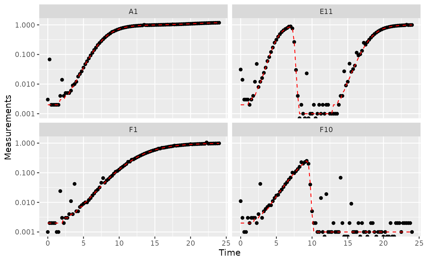
Great! Here we can see how the noisy (points) and noiseless (red line) data compare. We’ve plotted our data with log-transformed y-axes, which are useful because exponential growth is a straight line when plotted on a log scale. log axes also reveal another common pattern: random noise tends to have a much larger effect at low densities.
This level of noise doesn’t seem like it would mess up calculations of maximum density or area under the curve much, so that’s not enough of a reason to smooth. But let’s look at what our derivatives look like.
ex_dat_mrg <-
  mutate(group_by(ex_dat_mrg, Well, Bacteria_strain, Phage, noise),
         deriv_2 = calc_deriv(x = Time, y = Measurements),
         derivpercap_2 = calc_deriv(x = Time, y = Measurements,
                                   percapita = TRUE, blank = 0))

# Plot derivative
ggplot(data = dplyr::filter(ex_dat_mrg, Well %in% sample_wells, noise == "Yes"),
       aes(x = Time, y = deriv_2)) +
  geom_point() +
  geom_line(data = dplyr::filter(ex_dat_mrg, Well %in% sample_wells, noise == "No"),
            lty = 2, color = "red") +
  facet_wrap(~Well, scales = "free_y")
#> Warning: Removed 4 rows containing missing values (`geom_point()`).
#> Warning: Removed 1 row containing missing values (`geom_line()`).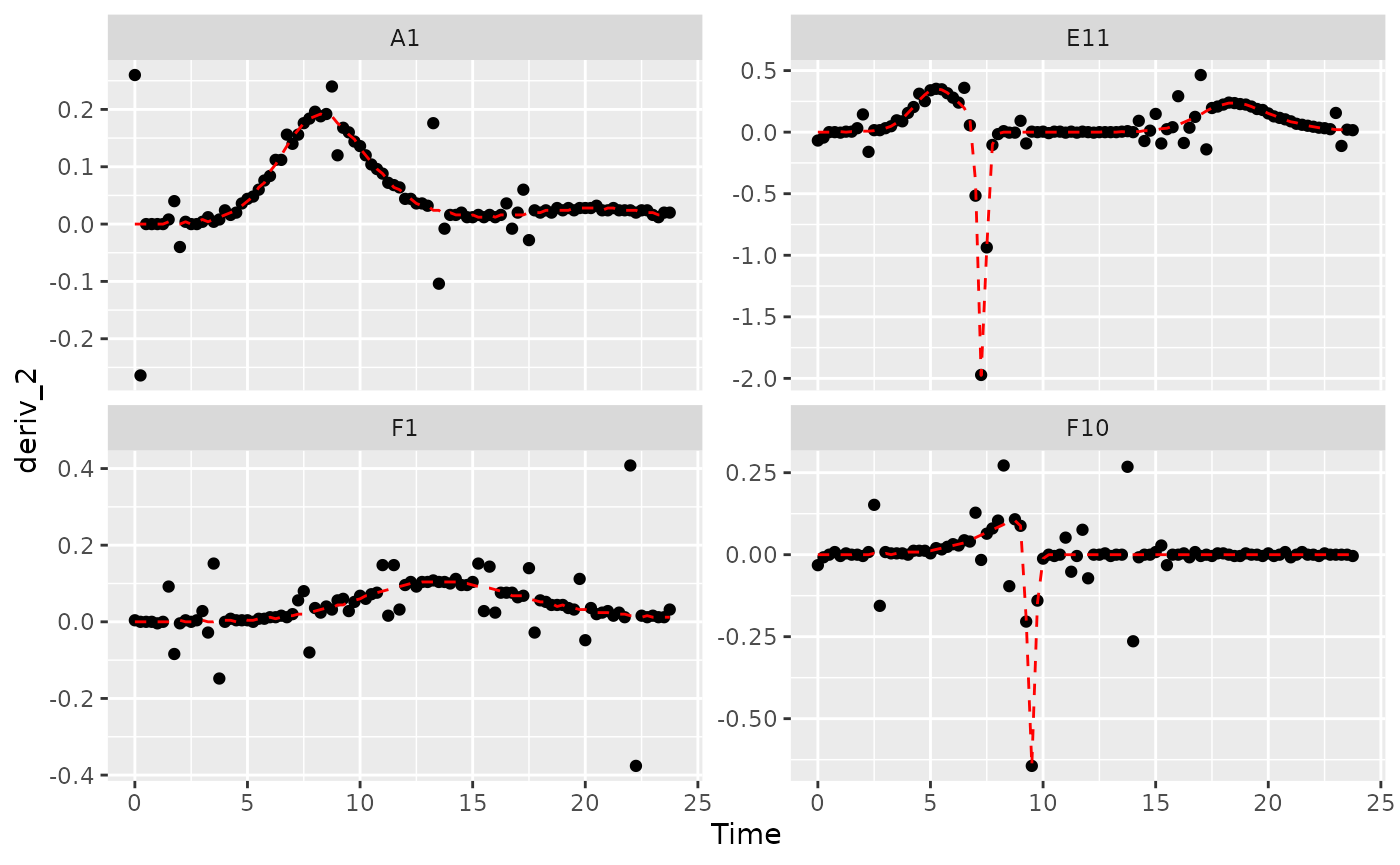
# Plot per-capita derivative
ggplot(data = dplyr::filter(ex_dat_mrg, Well %in% sample_wells, noise == "Yes"),
       aes(x = Time, y = derivpercap_2)) +
  geom_point() +
  geom_line(data = dplyr::filter(ex_dat_mrg, Well %in% sample_wells, noise == "No"),
            lty = 2, color = "red") +
  facet_wrap(~Well, scales = "free_y")
#> Warning: Removed 8 rows containing missing values (`geom_point()`).
#> Removed 1 row containing missing values (`geom_line()`).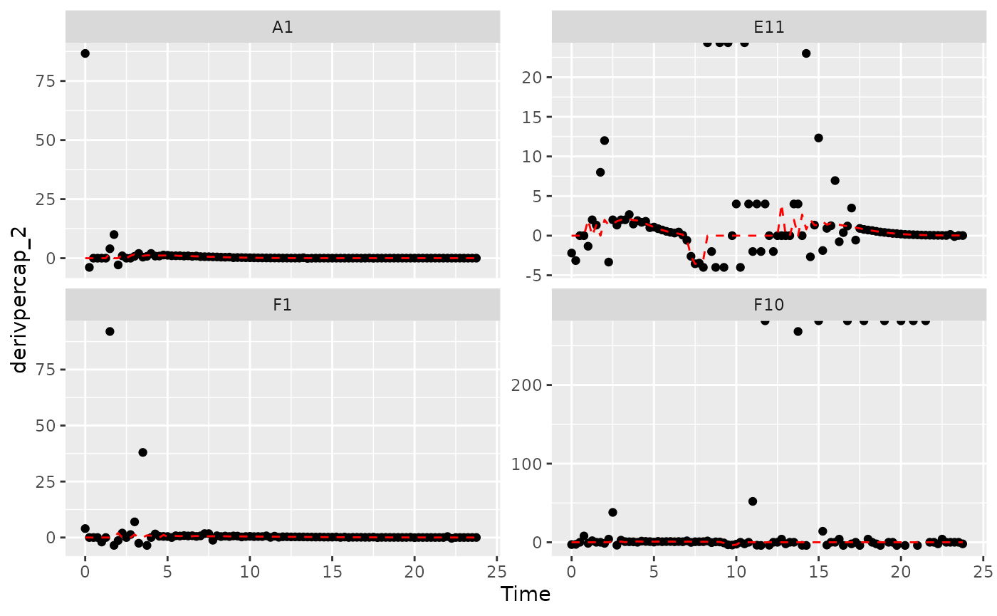
Those values are jumping all over the place, including some where the growth rate was calculated as infinite! Let’s see what we can do to address this.
Fitting during derivative calculation
One thing we can do is calculate derivatives by fitting a line to a
moving window of multiple points. (You might recall we previously used
this in the Calculating Derivatives article
vignette("process").)
To use the fitting functionality of calc_deriv, specify
either the window_width or the window_width_n
parameter. window_width specifies how wide the window used
to include points for the fitting is in units of x, while
window_width_n specifies it in number of data points. Wider
windows will be more smoothed. Note that when using
calc_deriv in this way, you should use as few
points as is necessary for your analyses to work, so you should
visualize different window widths and choose the smallest one that is
sufficient for your analyses to succeed.
ex_dat_mrg <-
  mutate(group_by(ex_dat_mrg, Well, Bacteria_strain, Phage, noise),
         deriv_5 = calc_deriv(x = Time, y = Measurements,
                            window_width_n = 5),
         derivpercap_5 = calc_deriv(x = Time, y = Measurements,
                                   percapita = TRUE, blank = 0,
                                   window_width_n = 5),
         deriv_9 = calc_deriv(x = Time, y = Measurements,
                            window_width_n = 9),
         derivpercap_9 = calc_deriv(x = Time, y = Measurements,
                                   percapita = TRUE, blank = 0,
                                   window_width_n = 9))
#Reshape our data for plotting purposes
ex_dat_mrg_wide <-
  pivot_longer(ex_dat_mrg, cols = starts_with("deriv"),
               names_to = c("deriv", "window_width_n"), names_sep = "_")
ex_dat_mrg_wide <-
  pivot_wider(ex_dat_mrg_wide, names_from = deriv, values_from = value)

#Plot derivative
ggplot(data = dplyr::filter(ex_dat_mrg_wide, Well %in% sample_wells, noise == "Yes"),
       aes(x = Time, y = deriv)) +
  geom_line(aes(color = window_width_n), lwd = 1, alpha = 0.75) +
  facet_wrap(~Well, scales = "free_y") +
  geom_line(data = dplyr::filter(ex_dat_mrg_wide, Well %in% sample_wells,
                                 noise == "No", window_width_n == 2),
            lty = 2, color = "red") +
  scale_color_grey(start = 0.7, end = 0.1)
#> Warning: Removed 13 rows containing missing values (`geom_line()`).
#> Warning: Removed 1 row containing missing values (`geom_line()`).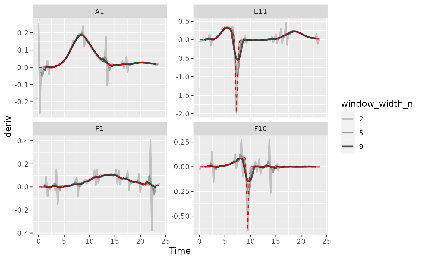
#Plot per-capita derivative
ggplot(data = dplyr::filter(ex_dat_mrg_wide, Well %in% sample_wells, noise == "Yes"),
       aes(x = Time, y = derivpercap)) +
  geom_line(aes(color = window_width_n), lwd = 1, alpha = 0.75) +
  facet_wrap(~Well, scales = "free_y") +
  geom_line(data = dplyr::filter(ex_dat_mrg_wide, Well %in% sample_wells,
                                 noise == "No", window_width_n == 5),
            lty = 2, color = "red") +
  scale_color_grey(start = 0.7, end = 0.1) +
  ylim(NA, 5)
#> Warning: Removed 14 rows containing missing values (`geom_line()`).
#> Warning: Removed 4 rows containing missing values (`geom_line()`).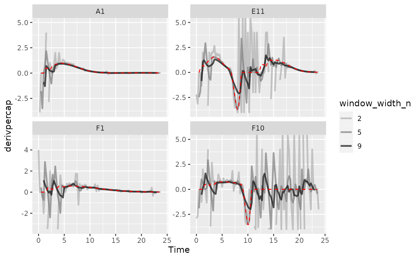
As we can see, increasing the width of the window reduces the effects
of noise, getting us closer to the noiseless data (red line). However,
if we go too far (like window_width_n = 9 for the plain
derivative), we’ll start over-smoothing our data, making peaks shorter
and valleys shallower.
Smoothing raw data
Smoothing raw density data is a straightforward approach to reduce
the effects of noise. gcplyr has a smooth_data
function that can carry out such smoothing. smooth_data has
four different smoothing algorithms to choose from:
moving-average, moving-median,
loess, and gam.
-
moving-averageis a simple smoothing algorithm that primarily acts to reduce the effects of outliers on the data -
moving-medianis another simple smoothing algorithm that primarily acts to reduce the effects of outliers on the data -
loessis a spline-fitting approach that uses polynomial-like curves, which produces curves with smoothly changing derivatives, but can in some cases create curvature artifacts not present in the original data -
gamis also spline-fitting approach that uses polynomial-like curves, which produces curves with smoothly changing derivatives, but can in some cases create curvature artifacts not present in the original data
Additionally, all four smoothing algorithms have a tuning parameter that controls how “smoothed” the data are.
Smoothing data is a step that alters the values you will analyze. Because of that it can be rife with pitfalls. You should strive to do as little smoothing as is necessary for your analyses to work. To do so, run smoothing with different tuning parameter values and plot the results. Then, choose the parameter value that smooths the data as little as necessary. Additionally, when sharing your findings, it’s important to be transparent by sharing the raw data and smoothing methods, rather than treating the smoothed data as your source.
To use smooth_data, pass your x and y values, your
method of choice, and any additional arguments needed for the method. It
will return a vector of your smoothed y values.
Smoothing with moving-average
For moving-average, there are two tuning parameters to
choose between: window_width specifies how wide the window
used to include points for the fitting is in units of x,
while window_width_n specifies it in number of data points.
Wider windows will be more smoothed. Here, we’ll show moving averages
with window_width_n values of 5 or 9 data points wide
(movavg_1 is just our raw, unsmoothed data).
ex_dat_mrg <-
  mutate(group_by(ex_dat_mrg, Well, Bacteria_strain, Phage, noise),
         movavg_1 = Measurements,
         movavg_5 = smooth_data(x = Time, y = Measurements,
              sm_method = "moving-average", window_width_n = 5),
         movavg_9 = smooth_data(x = Time, y = Measurements,
              sm_method = "moving-average", window_width_n = 9))

#Reshape our data for plotting purposes
ex_dat_mrg_wide <-
  pivot_longer(ex_dat_mrg, cols = starts_with("movavg"),
               names_prefix = "movavg_", names_to = "window_width_n")

#Plot data
ggplot(data = dplyr::filter(ex_dat_mrg_wide, Well %in% sample_wells, noise == "Yes"),
       aes(x = Time, y = value)) +
  geom_line(aes(color = window_width_n), lwd = 1, alpha = 0.75) +
  facet_wrap(~Well, scales = "free_y") +
  geom_line(data = dplyr::filter(ex_dat_mrg_wide, Well %in% sample_wells,
                                 noise == "No", window_width_n == 1),
            lty = 2, color = "red") +
  scale_color_grey(start = 0.7, end = 0.1) +
  scale_y_log10() +
  ggtitle("moving-average")
#> Warning: Transformation introduced infinite values in continuous y-axis
#> Warning: Removed 12 rows containing missing values (`geom_line()`).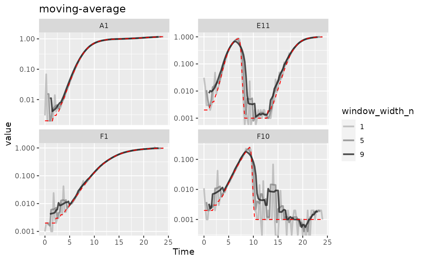
Here we can see that moving-average has helped reduce
the effects of some of that early noise. However, as the window width
gets larger, it also starts underrepresenting the maximum density peaks
relative to the true value (red line).
Smoothing with moving-median
For moving-median, there are the same two tuning
parameters: window_width specifies how wide the window used
to include points for the fitting is in units of x, while
window_width_n specifies it in number of data points. Wider
windows will be more smoothed. Here, we’ll show moving medians with
windows that are 5 and 9 data points wide (movemed_1 is
just our raw, unsmoothed data).
ex_dat_mrg <-
  mutate(group_by(ex_dat_mrg, Well, Bacteria_strain, Phage, noise),
         movmed_1 = Measurements,
         movmed_5 =
           smooth_data(x = Time, y = Measurements,
                       sm_method = "moving-median", window_width_n = 5),
         movmed_9 =
           smooth_data(x = Time, y = Measurements,
                       sm_method = "moving-median", window_width_n = 9))

#Reshape our data for plotting purposes
ex_dat_mrg_wide <-
  pivot_longer(ex_dat_mrg, cols = starts_with("movmed"),
               names_prefix = "movmed_", names_to = "window_width_n")

#Plot data
ggplot(data = dplyr::filter(ex_dat_mrg_wide, Well %in% sample_wells, noise == "Yes"),
       aes(x = Time, y = value)) +
  geom_line(aes(color = window_width_n), lwd = 1, alpha = 0.75) +
  facet_wrap(~Well, scales = "free_y") +
  geom_line(data = dplyr::filter(ex_dat_mrg_wide, Well %in% sample_wells,
                                 noise == "No", window_width_n == 1),
            lty = 2, color = "red") +
  scale_color_grey(start = 0.7, end = 0.1) +
  scale_y_log10() +
  ggtitle("moving-median")
#> Warning: Transformation introduced infinite values in continuous y-axis
#> Warning: Removed 12 rows containing missing values (`geom_line()`).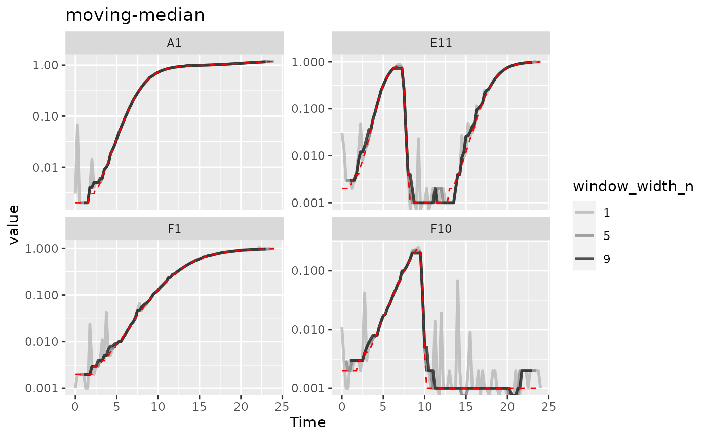
Here we can see that moving-median has done a great job
excluding noise without biasing our data very far from the true values
(red line). However, it has produced a smoothed density that is fairly
“jumpy”, something that is common with moving-median. To address this,
you often will need to combine moving-median with other
smoothing methods.
Smoothing with LOESS
For loess, the tuning parameter is the span
argument. loess works by doing fits on subset windows of
the data centered at each data point. These fits can be linear
(degree = 1) or polynomial (typically
degree = 2). span is the width of the window,
as a fraction of all data points. For instance, with the default
span of 0.75, 75% of the data points are included in each
window. Thus, span values typically are between 0 and 1 (although see
?loess for use of span values greater than 1),
and larger values are more “smoothed”. Here, we’ll show
loess smoothing with spans of 0.15 and 0.35 and
degree = 1 (loess_0 is just our raw,
unsmoothed data).
ex_dat_mrg <-
  mutate(group_by(ex_dat_mrg, Well, Bacteria_strain, Phage, noise),
         loess_0 = Measurements,
         loess_15 = smooth_data(x = Time, y = Measurements,
                                 sm_method = "loess", span = .15, degree = 1),
         loess_35 = smooth_data(x = Time, y = Measurements,
                                 sm_method = "loess", span = .35, degree = 1))

#Reshape our data for plotting purposes
ex_dat_mrg_wide <-
  pivot_longer(ex_dat_mrg, cols = starts_with("loess"),
               names_prefix = "loess_", names_to = "span")

#Plot data
ggplot(data = dplyr::filter(ex_dat_mrg_wide, Well %in% sample_wells, noise == "Yes"),
       aes(x = Time, y = value)) +
  geom_line(aes(color = as.factor(as.numeric(span)/100)), lwd = 1, alpha = 0.75) +
  facet_wrap(~Well, scales = "free_y") +
  geom_line(data = dplyr::filter(ex_dat_mrg_wide, Well %in% sample_wells,
                                 noise == "No", span == 0),
            lty = 2, color = "red") +
  scale_color_grey(name = "span", start = 0.7, end = 0.1) +
  scale_y_log10() +
  ggtitle("loess")
#> Warning in self$trans$transform(x): NaNs produced
#> Warning: Transformation introduced infinite values in continuous y-axis
#> Warning: Removed 2 rows containing missing values (`geom_line()`).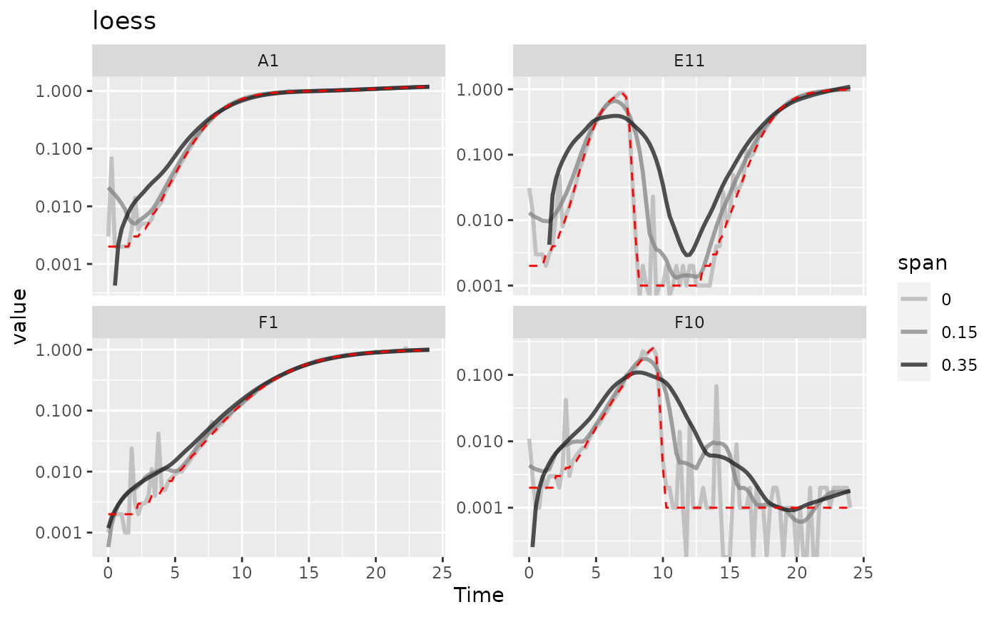
Here we can see that loess with smaller spans have
smoothed the data somewhat but are still sensitive to outliers. However,
loess with a larger span has introduced significant bias
relative to the true values (red line). It doesn’t seem like
loess is working well for this data.
Smoothing with GAM
For gam, the primary tuning parameter is the
k argument. gam works by doing fits on subsets
of the data and linking these fits together. k determines
how many link points (“knots”) it can use. If not specified, the default
k value for smoothing a time series is 10, with
smaller values being more “smoothed” (note this is
opposite the trend with other smoothing methods). However,
unlike earlier methods, k values that are too large
are also problematic, as they will tend to ‘overfit’ the data.
k cannot be larger than the number of data points, and
should usually be substantially smaller than that. Also note that
gam can sometimes create artifacts,
especially oscillations in your density and derivatives. You should
check that gam is not doing so before carrying on with your
analyses. Here, we’ll show gam smoothing with
k values of 8 and 15 (gam_97 is just our raw,
unsmoothed data).
ex_dat_mrg <-
  mutate(group_by(ex_dat_mrg, Well, Bacteria_strain, Phage, noise),
         gam_97 = Measurements,
         gam_15 = smooth_data(x = Time, y = Measurements,
                                  sm_method = "gam", k = 15),
         gam_8 = smooth_data(x = Time, y = Measurements,
                                 sm_method = "gam", k = 8))

#Reshape our data for plotting purposes
ex_dat_mrg_wide <-
  pivot_longer(ex_dat_mrg, cols = starts_with("gam"),
               names_prefix = "gam_", names_to = "k")

#Plot data
ggplot(data = dplyr::filter(ex_dat_mrg_wide, Well %in% sample_wells, noise == "Yes"),
       aes(x = Time, y = value)) +
  geom_line(aes(color = as.factor(as.numeric(k))), lwd = 1, alpha = 0.75) +
  facet_wrap(~Well, scales = "free_y") +
  geom_line(data = dplyr::filter(ex_dat_mrg_wide, Well %in% sample_wells,
                                 noise == "No", k == 97),
            lty = 2, color = "red") +
  scale_color_grey(name = "span", start = 0.1, end = 0.7) +
  scale_y_log10() +
  ggtitle("gam")
#> Warning in self$trans$transform(x): NaNs produced
#> Warning: Transformation introduced infinite values in continuous y-axis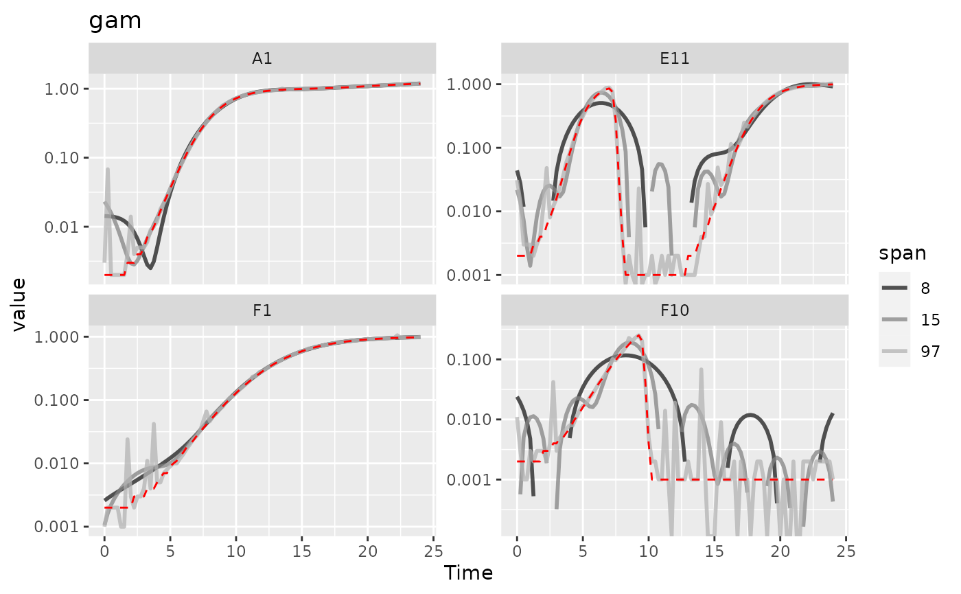
Here we can see that gam with lower values of
k increasingly smooths the data. However, at basically all
values of k it introduces significant bias and artifacts,
so it doesn’t seem like gam is working well for this
data.
Combining multiple smoothing methods
Often, combining multiple smoothing methods can provide improved
results. For instance, moving-median is particularly good
at removing outliers, but not very good at producing continuously smooth
data. In contrast, moving-average, loess, and
gam work better at producing continuously smooth data, but
aren’t as good at removing outliers. Here’s an example using the
strengths of both moving-median and
moving-average.
ex_dat_mrg <-
  mutate(group_by(ex_dat_mrg, Well, Bacteria_strain, Phage, noise),
         smoothed_no = Measurements,
         sm_med3 =
           smooth_data(x = Time, y = Measurements,
                       sm_method = "moving-median", window_width_n = 3),
         #Note that for the second round, we're using the
         #first smoothing as the input y
         smoothed_yes =
           smooth_data(x = Time, y = sm_med3,
                       sm_method = "moving-average", window_width_n = 3))

#Reshape our data for plotting purposes
ex_dat_mrg_wide <-
  pivot_longer(ex_dat_mrg, cols = starts_with("smoothed"),
               names_to = "smoothed", names_prefix = "smoothed_")

#Plot data
ggplot(data = dplyr::filter(ex_dat_mrg_wide, Well %in% sample_wells, noise == "Yes"),
       aes(x = Time, y = value, color = smoothed)) +
  geom_line(lwd = 1, alpha = 0.75) +
  scale_color_grey(start = 0.7, end = 0.1) +
  facet_wrap(~Well, scales = "free_y") +
  geom_line(data = dplyr::filter(ex_dat_mrg_wide, Well %in% sample_wells,
                                 noise == "No", smoothed == "no"),
            lty = 2, color = "red") +
  scale_y_log10() +
  ggtitle("median then average smoothing")
#> Warning: Transformation introduced infinite values in continuous y-axis
#> Warning: Removed 4 rows containing missing values (`geom_line()`).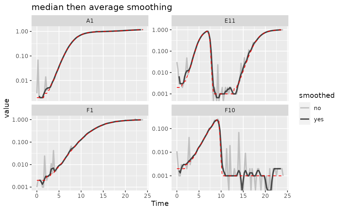
Here we can see that the combination of minimal
moving-median and moving-average smoothing has
produced a curve that has most of the noise removed with minimal
introduction of bias relative to the true values (red line).
Calculating derivatives of smoothed data
Once you’ve smoothed your data, you can calculate derivatives using the smoothed data. Combining smoothing of raw data and fitting using multiple points for calculating derivatives can be a powerful combination for reducing the effects of noise while minimizing the introduction of bias.
# Note here that we're calculating derivatives of the smoothed column generated
#  in the previous section by combining moving median and moving average smoothing
ex_dat_mrg <-
  mutate(group_by(ex_dat_mrg, Well, Bacteria_strain, Phage, noise),
         smderiv_0 = calc_deriv(x = Time, y = Measurements),
         smderivpercap_0 = calc_deriv(x = Time, y = Measurements,
                                       percapita = TRUE, blank = 0),
         smderiv_3 = calc_deriv(x = Time, y = smoothed_yes, window_width_n = 3),
         smderivpercap_3 = calc_deriv(x = Time, y = smoothed_yes, percapita = TRUE,
                                    blank = 0, window_width_n = 3))

#Reshape our data for plotting purposes
ex_dat_mrg_wide <-
  pivot_longer(ex_dat_mrg, cols = starts_with("smderiv"),
               names_to = c("deriv", "window_width_n"), names_sep = "_")
ex_dat_mrg_wide <-
  pivot_wider(ex_dat_mrg_wide, names_from = deriv, values_from = value)

#Plot derivative
ggplot(data = dplyr::filter(ex_dat_mrg_wide, Well %in% sample_wells, noise == "Yes"),
       aes(x = Time, y = smderiv, color = window_width_n)) +
  geom_line(lwd = 1, alpha = 0.75) +
  scale_color_grey(start = 0.7, end = 0.1) +
  facet_wrap(~Well, scales = "free_y") +
  geom_line(data = dplyr::filter(ex_dat_mrg_wide, Well %in% sample_wells,
                                 noise == "No", window_width_n == 0),
            lty = 2, color = "red")
#> Warning: Removed 7 rows containing missing values (`geom_line()`).
#> Warning: Removed 1 row containing missing values (`geom_line()`).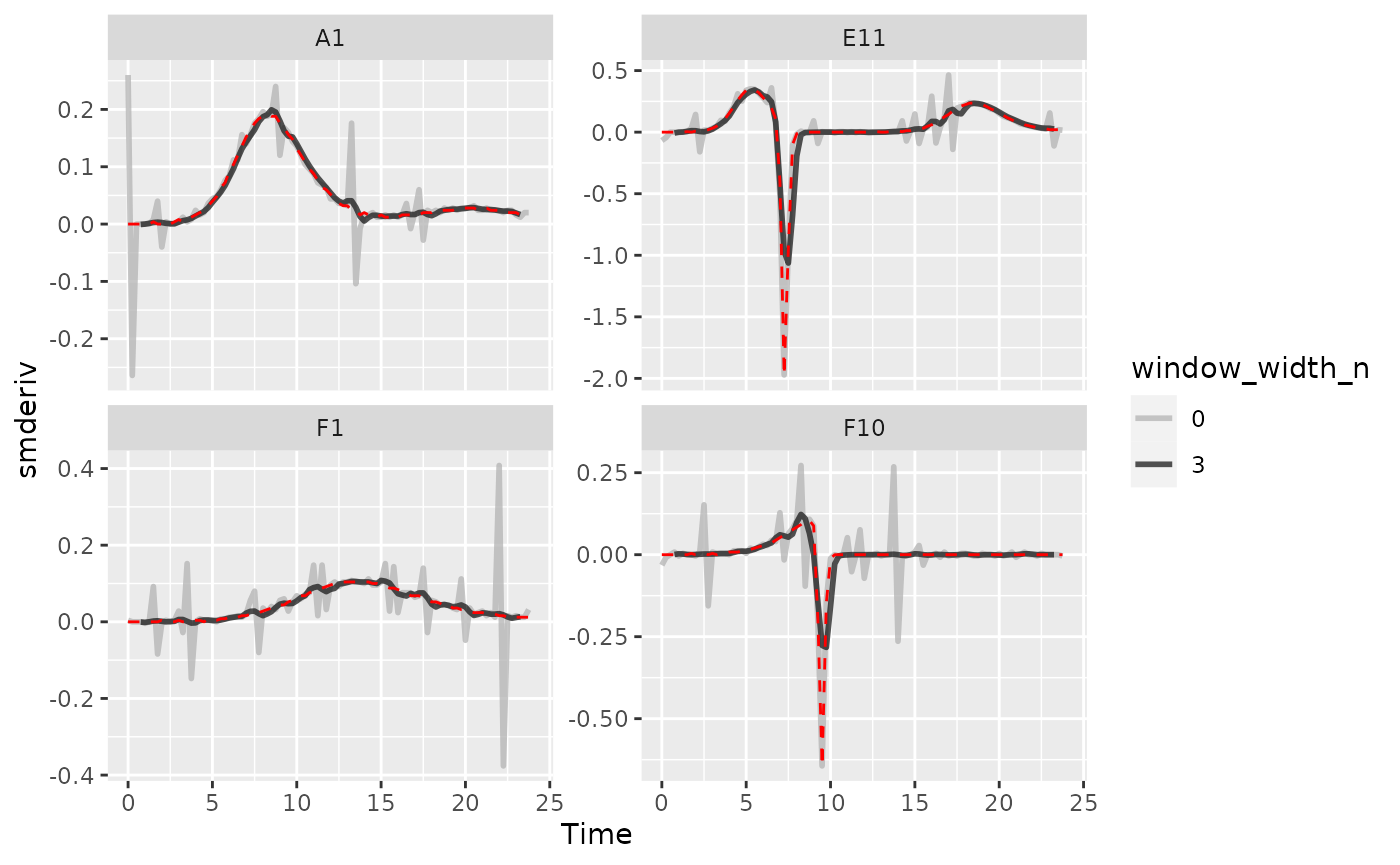
#Plot per-capita derivative
ggplot(data = dplyr::filter(ex_dat_mrg_wide, Well %in% sample_wells, noise == "Yes"),
       aes(x = Time, y = smderivpercap, color = window_width_n)) +
  geom_line(lwd = 1, alpha = 0.75) +
  scale_color_grey(start = 0.7, end = 0.1) +
  facet_wrap(~Well, scales = "free_y") +
  geom_line(data = dplyr::filter(ex_dat_mrg_wide, Well %in% sample_wells,
                                 noise == "No", window_width_n == 3),
            lty = 2, color = "red") +
  ylim(NA, 5)
#> Warning: Removed 8 rows containing missing values (`geom_line()`).
#> Warning: Removed 6 rows containing missing values (`geom_line()`).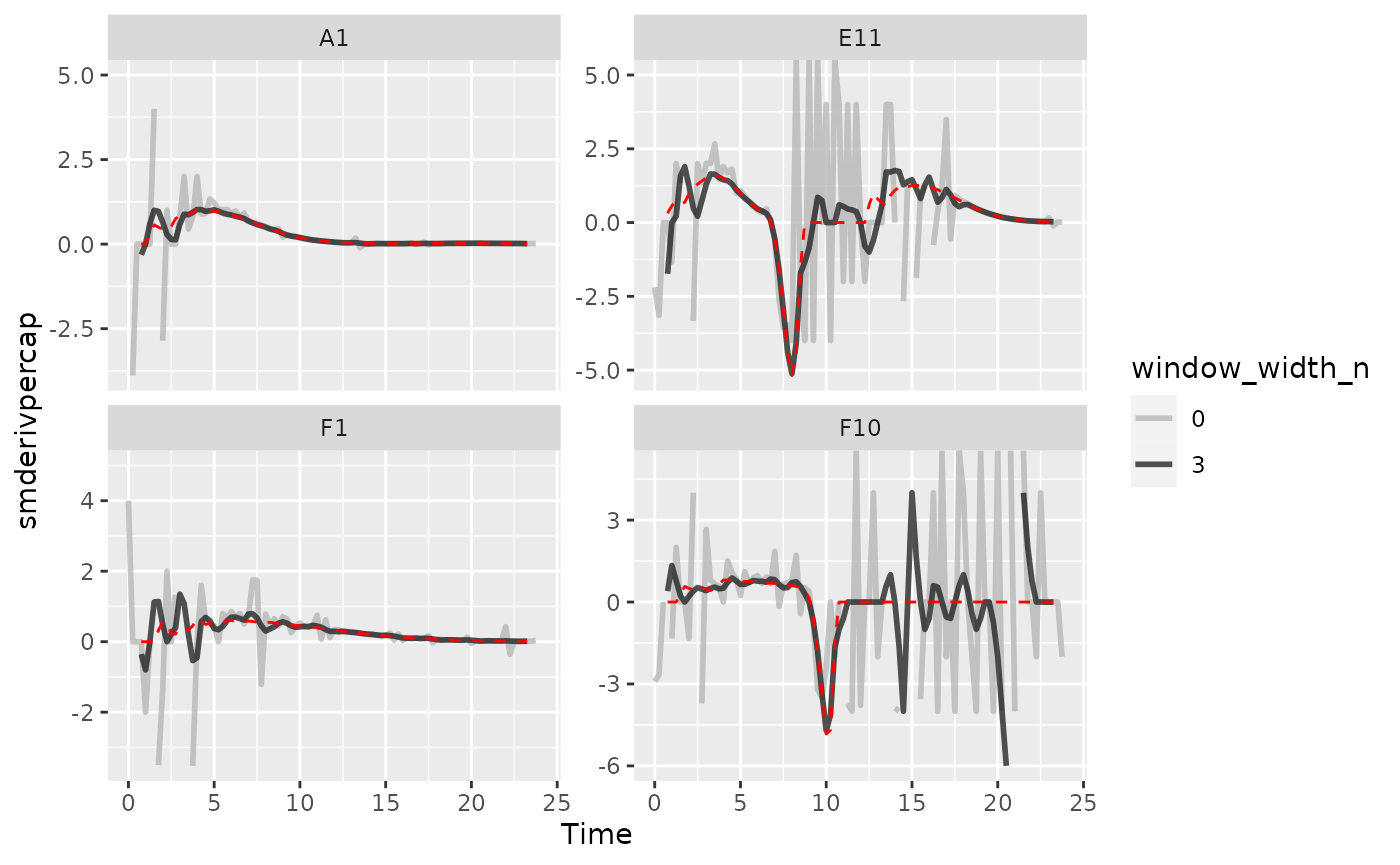
Here we can see that calculating derivatives from smoothed raw data can be a powerfully useful combination.
Summarizing on subsets of derivatives
There is one final strategy we can employ when dealing with noisy data: excluding data points where the density is near 0. If we compare our per-capita growth rates and our density plots, we’ll see that most of the noise occurs when the density is very close to 0:
#Plot density
ggplot(data = dplyr::filter(ex_dat_mrg, Well %in% sample_wells, noise == "Yes"),
       aes(x = Time, y = smoothed_yes)) +
  geom_point() +
  facet_wrap(~Well, scales = "free_y") +
  scale_y_log10()
#> Warning: Transformation introduced infinite values in continuous y-axis
#> Warning: Removed 16 rows containing missing values (`geom_point()`).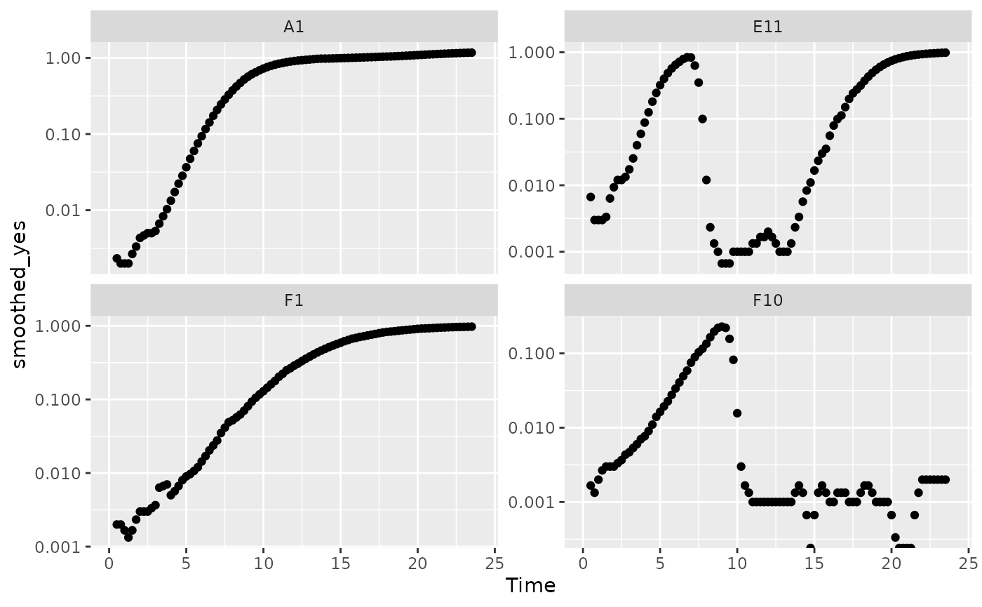
# Plot per-capita derivative
ggplot(data = dplyr::filter(ex_dat_mrg, Well %in% sample_wells, noise == "Yes"),
       aes(x = Time, y = derivpercap_5)) +
  geom_point() +
  facet_wrap(~Well, scales = "free_y")
#> Warning: Removed 16 rows containing missing values (`geom_point()`).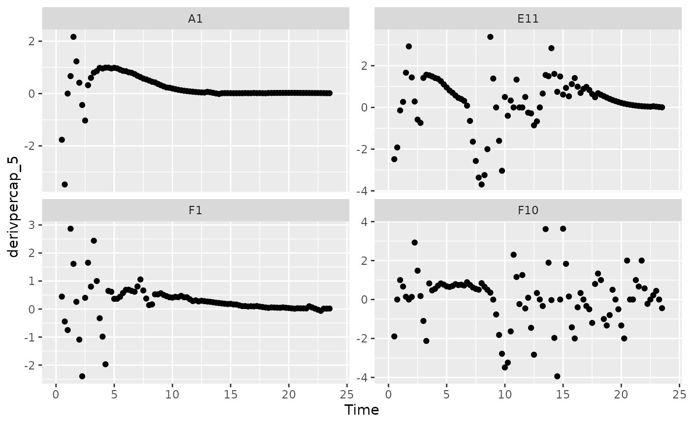
Per-capita growth rates are often very noisy when the density is close to 0, so it can make sense to simply exclude those data points.
#Plot density
ggplot(data = dplyr::filter(ex_dat_mrg, Well %in% sample_wells, noise == "Yes",
                            smoothed_yes > 0.01),
       aes(x = Time, y = smoothed_yes)) +
  geom_point() +
  facet_wrap(~Well, scales = "free_y") +
  geom_hline(yintercept = 0.01, lty = 2) +
  scale_y_log10()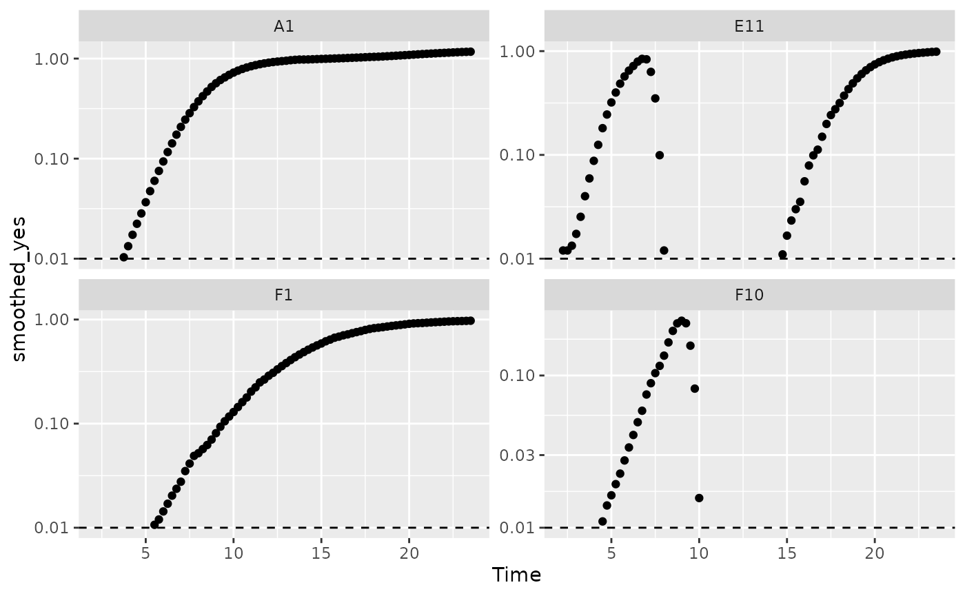
# Plot per-capita derivative
ggplot(data = dplyr::filter(ex_dat_mrg, Well %in% sample_wells, noise == "Yes",
                            smoothed_yes > 0.01),
       aes(x = Time, y = derivpercap_5)) +
  geom_point() +
  facet_wrap(~Well, scales = "free_y")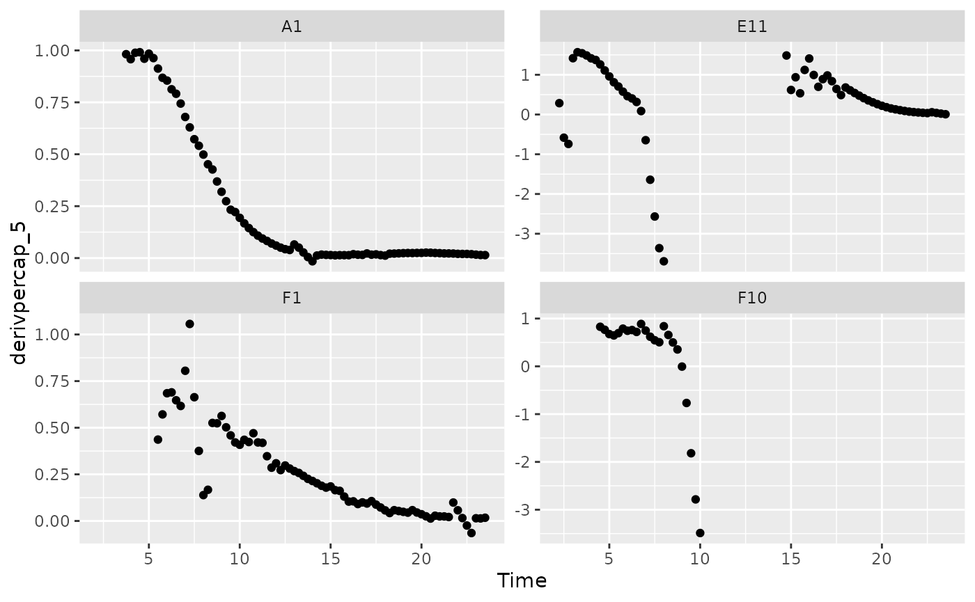
When we limit our analysis to data points where the density is not too close to 0, much of the noise in our per-capita derivative disappears.
To take this to the final step, we can use these cutoffs in our
summarize commands to calculate the maximum growth rate of
the bacteria when their density is at least 0.01.
ex_dat_mrg_sum <-
  summarize(group_by(ex_dat_mrg, Well, Bacteria_strain, Phage, noise),
            max_growth_rate = max(derivpercap_5[smoothed_yes > 0.01],
                                  na.rm = TRUE))
#> `summarise()` has grouped output by 'Well', 'Bacteria_strain', 'Phage'. You can
#> override using the `.groups` argument.
head(ex_dat_mrg_sum)
#> # A tibble: 6 × 5
#> # Groups:   Well, Bacteria_strain, Phage [3]
#>   Well  Bacteria_strain Phage       noise max_growth_rate
#>   <fct> <chr>           <chr>       <chr>           <dbl>
#> 1 A1    Strain 1        No Phage    No              1.00
#> 2 A1    Strain 1        No Phage    Yes             0.991
#> 3 E11   Strain 29       Phage Added No              1.53
#> 4 E11   Strain 29       Phage Added Yes             1.57
#> 5 F1    Strain 31       No Phage    No              0.597
#> 6 F1    Strain 31       No Phage    Yes             1.06
What’s next?
Now that you’ve analyzed your data and dealt with any noise, there’s just some concluding notes on best practices for running statistics, merging growth curve analyses with other data, and additional resources for analyzing growth curves.
- Introduction:
vignette("gcplyr") - Importing and transforming data:
vignette("import_transform") - Incorporating design information:
vignette("incorporate_designs") - Pre-processing and plotting your data:
vignette("preprocess_plot") - Processing your data:
vignette("process") - Analyzing your data:
vignette("analyze") - Dealing with noise:
vignette("noise") -
Statistics, merging other data, and other
resources:
vignette("conclusion")